Guide
Competitor analysis examples, and the evidence behind each one
By coExploro · Published · Updated
Reviewed and edited by coExploro · Independent, not affiliated · Public methodology · Corrections: support@coexploro.com
These ten competitor analysis examples are findings from coExploro’s dated product teardowns, each with the quoted words, the page and the capture date. They are grouped by positioning, pricing, UX and onboarding entry points, followed by the scores of all 27 samples.
Sign up for free
Positioning: what does the product say it is?
Start with what each product claims to be, in the words its pages lead with. Contify’s hero placed ‘360° intelligence delivered’ over the promise ‘Grow faster than the market’. Klue’s first product card said its Compete Agent ‘delivers it to sellers the moment they need it’. OpenAI’s homepage put a chat box under ‘What can I help with?’ in the first block below its navigation. Contify makes an outcome claim, Klue ties a product to a moment in the sale and OpenAI invites a question. Write down each product’s line word for word, with the page and the date, and for your own comparison choose products a buyer would weigh for the same task.

Contify
Marketing · Captured
The hero promises growth faster than the market
In the capture the hero reads '360° intelligence delivered' over 'Grow faster than the market', with a star rating 'based on reviews from' G2 above a business email field and a 'Book a demo' button. A row of customer logos, including Honeywell Technologies, Airbus, Danone and McKinsey & Company, runs under it.
Evidence:
Grow faster than the market
· Seen on www.contify.com, homepage hero, second line of the headline · Captured · Direct evidence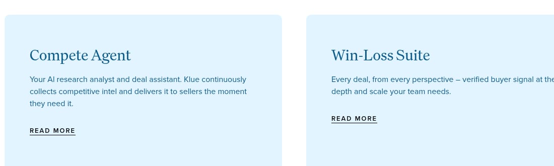
Klue
PM · Captured
Each product card ties its product to an outcome
The Compete Agent card says Klue 'continuously collects competitive intel and delivers it to sellers the moment they need it.' The Win-Loss Suite card offers 'verified buyer signal'.
Evidence:
delivers it to sellers the moment they need it
· Seen on klue.com, first product card below the hero, headed Compete Agent · Captured · Direct evidence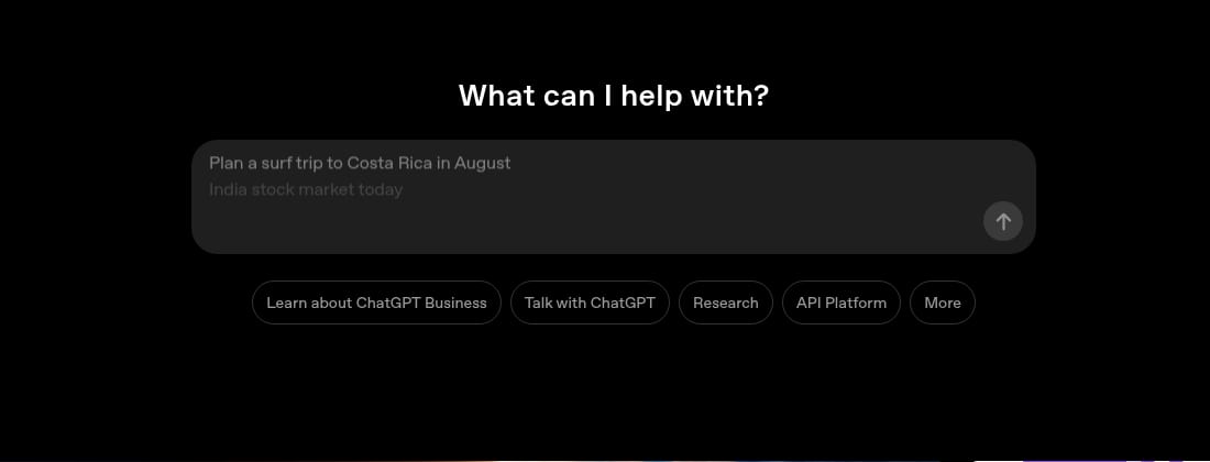
OpenAI
PM · Captured
The homepage opens on a chat box under What can I help with?
The first block under the navigation is the heading 'What can I help with?' above a message box. In the capture the box shows the example 'Plan a surf trip to Costa Rica in August', with a second, 'India stock market today', fading in under it, beside a send arrow.
Evidence:
What can I help with?
· Seen on openai.com, homepage, first block under the navigation · Captured · Direct evidence
Observed by us
Contify’s homepage still read ‘360° intelligence delivered’ and ‘Grow faster than the market’.
verified · Source: contify.com (opens in a new tab)
Observed by us
Klue’s homepage still said its Compete Agent ‘delivers it to sellers the moment they need it’.
verified · Source: klue.com (opens in a new tab)
Run the same analysis on a competitor
Each example on this page is one finding from a coExploro teardown. Paste a competitor’s homepage address. coExploro captures that page with the date, then the pricing and features pages when it finds them. An AI model lists what the screenshots show, and four AI analysts, PM (product manager), Marketing, UX (user experience) and Designer, draft findings from that list. A teardown usually takes 2–4 minutes. The sample cards here carry checked receipts: the words a finding quotes, where they sit on the page and the capture date. In a teardown you run, a finding can open the screenshot it was read from when one is attached, so you can check it before it goes into a slide. Compare, included with Pro, sets 2 to 5 teardowns side by side. You can try one run a day per network without an account, and create a free account afterwards to claim the full canvas, every finding and the sources. A free account includes 3 teardowns a month. Paid plans start at $16 a month, billed yearly. It reads public pages only, so it adds no traffic, keyword or revenue data.
Pricing: how does the page frame the choice?
A pricing page shows what a customer is charged for and how the page frames the choice. The pricing unit shows what the customer pays by: users, usage, credits or something else. Zoom’s pricing page marked its Pro plan ‘Most popular’, a label Zoom publishes. monday.com’s pricing page set a quote form with nine inputs beside the heading ‘Get a personalized quote from our sales team’. Kompyte’s plans page ended its ROI calculator on a single total, above a ‘Request a Breakdown’ button. For each rival, note the unit of the price, the billing period the page had selected and the plan it marks. The cards keep what each page showed on its capture date. Before you quote a price, save a dated screenshot and check the amount, currency, unit and billing period on it. Call something absent only within the part of the page you saw fully rendered, and keep a later check apart from the original capture.
Zoom
PM · Captured
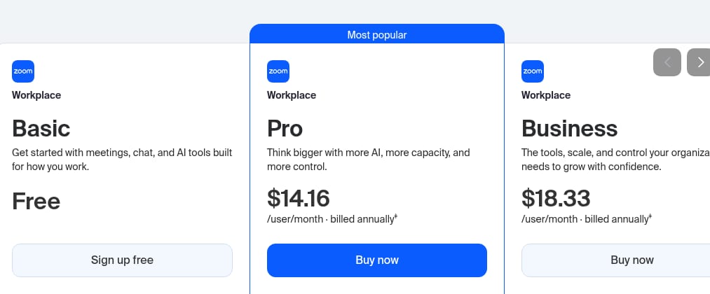
Pro is marked Most popular at $14.16 per user a month, billed annually
With prices in US dollars and the switch on 'Annually (Save up to 16%)', Basic reads 'Free', Pro '$14.16 /user/month · billed annually' under a 'Most popular' band, and Business '$18.33 /user/month · billed annually'. Each paid card has a 'Buy now' button.
Evidence:
Most popular
· Seen on zoom.us/pricing, Workplace plan cards on the pricing page, the band above Pro · Captured · Indirect evidence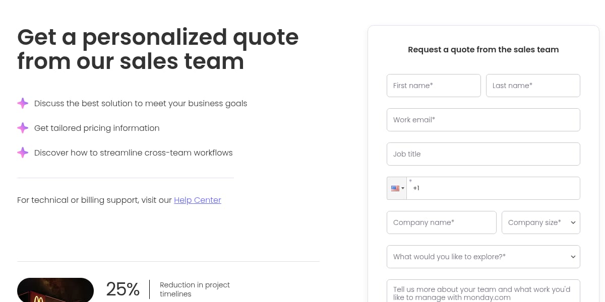
monday.com
UX · Captured
The sales quote form asks for nine inputs
The form headed 'Request a quote from the sales team' holds first name, last name, work email, job title, phone, company name, company size, 'What would you like to explore?' and a free-text box, then 'Submit'. Seven of the nine carry an asterisk. Job title and the free-text box do not.
Evidence:
Get a personalized quote from our sales team
· Seen on monday.com/pricing, pricing page, heading to the left of the quote form · Captured · Page context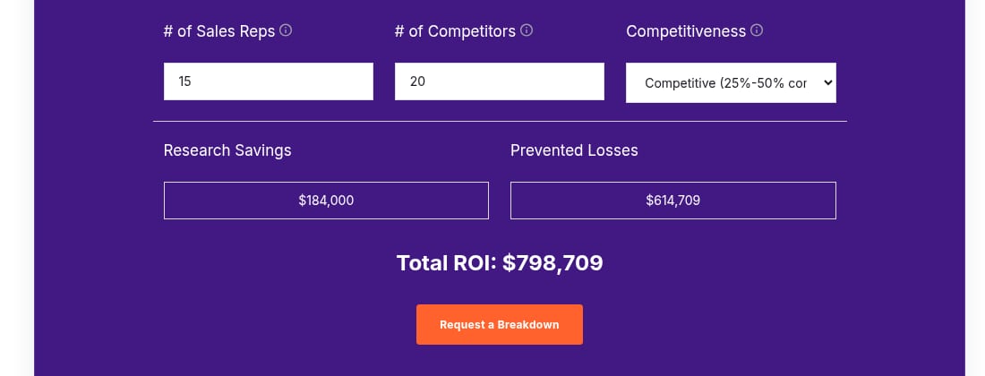
Kompyte
Designer · Captured
The ROI calculator ends on one total and a Request a Breakdown button
The plans page calculator starts from 15 sales reps and 20 competitors, shows 'Research Savings' of $184,000 and 'Prevented Losses' of $614,709, and adds them into 'Total ROI: $798,709' above an orange 'Request a Breakdown' button.
Evidence:
Total ROI: $798,709
· Seen on www.kompyte.com/plans, ROI calculator on the plans page · Captured · Direct evidence
Observed by us
Read from Europe, Zoom’s pricing page still showed a ‘Most popular’ band above Workplace Pro, priced per user a month and billed annually.
verified · Source: zoom.us/pricing (opens in a new tab)
Observed by us
Kompyte’s plans page still showed an ROI calculator ending in a total above a ‘Request a Breakdown’ button.
UX: how do the pages lead a visitor?
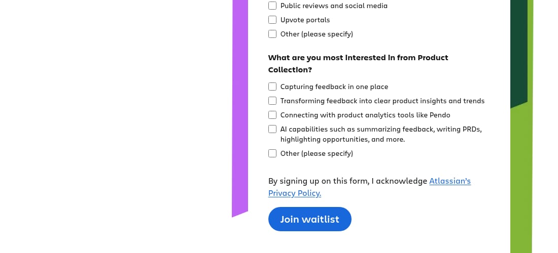
A UX reading of a competitor asks whether its pages keep the same labels and promises from one step to the next. Atlassian’s Product Collection page opened with a ‘Contact Us’ button, while the form further down the same page ended in ‘Join waitlist’. The button labels differ, so a question to test is whether a visitor sees how contacting the team relates to joining the waitlist. Crayon’s homepage labelled its demo button ‘Get a Demo’ in the navigation and ‘GET A DEMO’ in the hero and the closing banner. Read a competitor’s pages in the order a visitor meets them, and note each place where a label, a button or a layout changes; a capture shows the change, not whether it was intended. UX competitive analysis turns these questions into a template.
Atlassian
Marketing · Captured
The Product Collection hero says Contact Us while the form below says Join waitlist
The Product Collection page opens with 'Built for better product decisions in the AI era' and one 'Contact Us' button. Further down, 'Interested in Product Collection?' leads to a form with first name, last name, work email and company fields, three questions with checkboxes and a 'Join waitlist' button.
Evidence:
Join waitlist
· Seen on www.atlassian.com/collections/product, form near the end of the Product Collection page · Captured · Direct evidence
Crayon
Designer · Captured
The demo button label switches between title case and capitals
The navigation button reads 'Get a Demo', and so does the green button under the heading 'We beat our competitors.' further down. The hero button and the closing-banner button read 'GET A DEMO'.
Evidence:
No more manual competitor research
· Seen on www.crayon.co, closing banner heading, above the GET A DEMO button · Captured · Page context
Observed by us
Atlassian’s Product Collection page still ended its form in ‘Join waitlist’.
verified · Source: atlassian.com/collections/product (opens in a new tab)
Onboarding entry points: what can a visitor start?
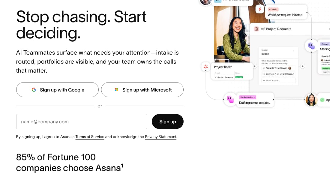
The last question is which next steps the first screen offers, before any onboarding: create an account, contact sales or download an app. Asana’s homepage offered ‘Sign up with Google’, ‘Sign up with Microsoft’ and an email field, with the line ‘85% of Fortune 100 companies choose Asana’ below the form. GitHub’s hero set an email field and a ‘Sign up for GitHub’ button beside a separate ‘Download GitHub Copilot app’ button, under the headline ‘The future of building happens together’. When we read the live page three days later, on 31 October, the headline was ‘Software still starts with you’ and both buttons were still there. That is why every example here carries its date. For your own product, the question to take away is whether a new visitor can tell which route fits their task. To compare two products question by question, SaaS competitor analysis works through Zapier and n8n.
Asana
Designer · Captured
The 85% of Fortune 100 line sits under the sign-up form
Under 'Stop chasing. Start deciding.', the sign-up block offers 'Sign up with Google', 'Sign up with Microsoft' and an email field. The line '85% of Fortune 100 companies choose Asana' sits below the form, with a footnote mark.
Evidence:
85% of Fortune 100 companies choose Asana
· Seen on asana.com, homepage, the line under the sign-up form · Captured · Direct evidence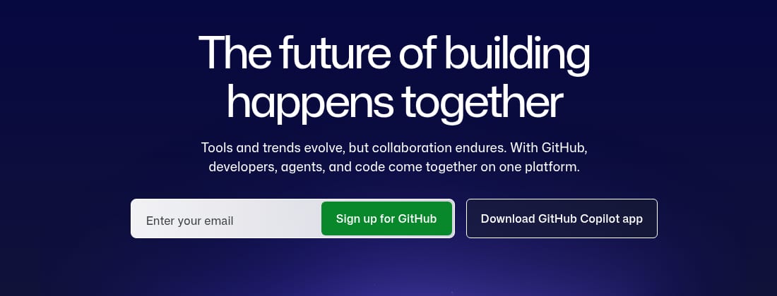
GitHub
UX · Captured
The hero offers sign-up and a Copilot app download side by side
Below the hero copy, an email field joins a green 'Sign up for GitHub' button, and a separate outlined button reads 'Download GitHub Copilot app'.
Evidence:
The future of building happens together
· Seen on github.com, homepage hero headline, above the two buttons · Captured · Page context
Observed by us
GitHub’s homepage showed the headline ‘Software still starts with you’, above an email field, ‘Sign up for GitHub’ and ‘Download GitHub Copilot app’.
verified · Source: github.com (opens in a new tab)
Observed by us
Asana’s homepage still showed ‘85% of Fortune 100 companies choose Asana’ under its sign-up options.
verified · Source: asana.com (opens in a new tab)
The scores of 27 product teardowns
For a competitor benchmark analysis, choose one question and evidence of the same kind for every product. The tables below show the scores published for coExploro’s 27 public samples. Each score comes from one capture of a product’s public pages, on the date in its row. The Overall score and the four analysts’ scores, PM, Marketing, UX and Designer, are the ones each sample page publishes, from 0 to 100. The Overall score combines the analysts’ readings; the UX column is the UX analyst’s own score. These are the scores the sample pages already publish: nothing was rescored for this page. The rows are in alphabetical order, not ranked: each score summarises one capture, and the pages captured differ from one product to the next.
Captured on 28 or 29 October 2026: 25 samples. Each row comes from one capture; sharing a table or a date does not make two products’ scores directly comparable.
- AsanaOverall score 69
Analysts’ scores: PM 72 · Marketing 77 · UX 62 · Designer 66
Captured
- AtlassianOverall score 68
Analysts’ scores: PM 68 · Marketing 64 · UX 66 · Designer 72
Captured
- CalendlyOverall score 70
Analysts’ scores: PM 72 · Marketing 62 · UX 68 · Designer 78
Captured
- CanvaOverall score 70
Analysts’ scores: PM 73 · Marketing 62 · UX 66 · Designer 78
Captured
- ClickUpOverall score 69
Analysts’ scores: PM 72 · Marketing 65 · UX 64 · Designer 75
Captured
- ContifyOverall score 71
Analysts’ scores: PM 74 · Marketing 74 · UX 64 · Designer 70
Captured
- CrayonOverall score 68
Analysts’ scores: PM 68 · Marketing 73 · UX 62 · Designer 70
Captured
- FigmaOverall score 69
Analysts’ scores: PM 72 · Marketing 62 · UX 67 · Designer 74
Captured
- GitHubOverall score 72
Analysts’ scores: PM 73 · Marketing 74 · UX 68 · Designer 71
Captured
- IntercomOverall score 68
Analysts’ scores: PM 69 · Marketing 74 · UX 61 · Designer 67
Captured
- KlueOverall score 67
Analysts’ scores: PM 71 · Marketing 68 · UX 57 · Designer 70
Captured
- KompyteOverall score 71
Analysts’ scores: PM 72 · Marketing 68 · UX 68 · Designer 74
Captured
- LinearOverall score 72
Analysts’ scores: PM 77 · Marketing 73 · UX 64 · Designer 74
Captured
- LoomOverall score 74
Analysts’ scores: PM 74 · Marketing 71 · UX 70 · Designer 82
Captured
- MiroOverall score 71
Analysts’ scores: PM 74 · Marketing 72 · UX 66 · Designer 72
Captured
- monday.comOverall score 69
Analysts’ scores: PM 71 · Marketing 73 · UX 63 · Designer 70
Captured
- n8nOverall score 71
Analysts’ scores: PM 70 · Marketing 79 · UX 63 · Designer 73
Captured
- NotionOverall score 71
Analysts’ scores: PM 76 · Marketing 75 · UX 66 · Designer 67
Captured
- OpenAIOverall score 69
Analysts’ scores: PM 70 · Marketing 71 · UX 63 · Designer 73
Captured
- ShopifyOverall score 70
Analysts’ scores: PM 75 · Marketing 68 · UX 66 · Designer 72
Captured
- SlackOverall score 73
Analysts’ scores: PM 72 · Marketing 78 · UX 62 · Designer 80
Captured
- SupabaseOverall score 74
Analysts’ scores: PM 80 · Marketing 74 · UX 67 · Designer 76
Captured
- WebflowOverall score 71
Analysts’ scores: PM 77 · Marketing 73 · UX 66 · Designer 69
Captured
- ZapierOverall score 70
Analysts’ scores: PM 75 · Marketing 70 · UX 62 · Designer 73
Captured
- ZoomOverall score 67
Analysts’ scores: PM 72 · Marketing 66 · UX 60 · Designer 70
Captured
| Product | Captured | Overall score | Analysts’ scores | |||
|---|---|---|---|---|---|---|
| PM | Marketing | UX | Designer | |||
| AsanaWork and project management | 69 | 72 | 77 | 62 | 66 | |
| AtlassianTeam collaboration software | 68 | 68 | 64 | 66 | 72 | |
| CalendlyScheduling automation | 70 | 72 | 62 | 68 | 78 | |
| CanvaDesign and publishing | 70 | 73 | 62 | 66 | 78 | |
| ClickUpWork management platform | 69 | 72 | 65 | 64 | 75 | |
| ContifyMarket and competitor monitoring platform | 71 | 74 | 74 | 64 | 70 | |
| CrayonCompetitor intel and sales battlecards | 68 | 68 | 73 | 62 | 70 | |
| FigmaProduct design tools | 69 | 72 | 62 | 67 | 74 | |
| GitHubDeveloper platform | 72 | 73 | 74 | 68 | 71 | |
| IntercomCustomer support platform | 68 | 69 | 74 | 61 | 67 | |
| KlueWin-loss and competitive research platform | 67 | 71 | 68 | 57 | 70 | |
| KompyteCompetitor tracking and sales battlecards | 71 | 72 | 68 | 68 | 74 | |
| LinearIssue tracking and product operations | 72 | 77 | 73 | 64 | 74 | |
| LoomAsync video messaging | 74 | 74 | 71 | 70 | 82 | |
| MiroOnline whiteboard and workspace | 71 | 74 | 72 | 66 | 72 | |
| monday.comWork management platform | 69 | 71 | 73 | 63 | 70 | |
| n8nWorkflow automation | 71 | 70 | 79 | 63 | 73 | |
| NotionConnected workspace and docs | 71 | 76 | 75 | 66 | 67 | |
| OpenAIAI models and API platform | 69 | 70 | 71 | 63 | 73 | |
| ShopifyCommerce platform | 70 | 75 | 68 | 66 | 72 | |
| SlackTeam communication | 73 | 72 | 78 | 62 | 80 | |
| SupabaseBackend-as-a-service on Postgres | 74 | 80 | 74 | 67 | 76 | |
| WebflowVisual web development | 71 | 77 | 73 | 66 | 69 | |
| ZapierAutomation platform | 70 | 75 | 70 | 62 | 73 | |
| ZoomVideo meetings platform | 67 | 72 | 66 | 60 | 70 | |
Scores from the October and August captures are not directly comparable, and these tables do not show whether a difference comes from the pages, the scoring or both.
Captured on 8 or 10 August 2026: 2 samples. Each row comes from one capture; sharing a table or a date does not make two products’ scores directly comparable.
| Product | Captured | Overall score | Analysts’ scores | |||
|---|---|---|---|---|---|---|
| PM | Marketing | UX | Designer | |||
| ClerkAuthentication infrastructure | 84 | 88 | 82 | 77 | 88 | |
| StripePayments infrastructure | 92 | 94 | 95 | 86 | 92 | |
Across the twenty-five October captures, Overall scores ran from 67 to 74, with a median of 70; the two August captures scored 84 and 92.
27 well-known products, not a market sample. How the scores are made.
Limits
What these competitor analysis examples do not show
- Each example shows a page on its capture date, 28 or 29 October 2026, and the page may have changed since. The checks after each group are separate readings of the live pages on 31 October 2026.
- One example is one AI analyst’s observation from one capture, not a review of the product or of its market.
- The 27 samples are well-known products coExploro chose to sample, not a market sample, so the tables describe these 27 captures and nothing wider.
- coExploro reads public pages only: no traffic, keyword, revenue or social media data, and nothing behind a login.
See it on a real product
The hero promises growth faster than the market · Contify
Evidence:
Grow faster than the market
· Seen on www.contify.com, homepage hero, second line of the headline · Captured · Direct evidenceEach product card ties its product to an outcome · Klue
Evidence:
delivers it to sellers the moment they need it
· Seen on klue.com, first product card below the hero, headed Compete Agent · Captured · Direct evidence
Contify
Market and competitor monitoring platform
Overall score 71 · Captured
Contify's homepage, Newsfeeds page and contact page: a hero promising growth faster than the market, five role tabs, and demo and trial buttons in turn.
Klue
Win-loss and competitive research platform
Overall score 67 · Captured
Klue's homepage as captured: a Blindspot Interviews bar above the menus, Compete Agent and Win-Loss Suite cards, and a '250,000+ users' heading.
OpenAI
AI models and API platform
Overall score 69 · Captured
OpenAI's homepage as captured: a chat box under What can I help with?, a featured story grid, and business stories naming Virgin Atlantic and Zapier.
Questions
What is a competitor analysis example?
It shows what a rival’s public pages say or offer, with the evidence: the words on the page, where they sit and the day they were read. The examples on this page are findings from coExploro’s public samples, grouped by the question each one answers: positioning, pricing, UX and onboarding entry points.
What should a competitor analysis include?
For a first reading of a software product’s public pages, start with four questions: what the product says it is, what it charges for, how its pages lead a visitor and what a visitor can start alone. Keep each answer with its quote, its page and its date, so another person can check it.
What is a competitor benchmark analysis?
It puts the same measure on several products, read the same way. The tables on this page show the scores of coExploro’s 27 samples in two groups by capture date. Each score comes from one capture: read it with that sample’s findings, not as a ranking or a direct comparison.
Are these scores a ranking of the best products?
No. Each score summarises one capture of a product’s public pages by coExploro’s AI analysts, the pages captured differ from one product to the next, and the 27 products are well-known names coExploro chose, not a market sample.
Can I get this analysis of my own competitors?
Yes. Paste a competitor’s address in the form on this page: coExploro captures its homepage, then its pricing and features pages when it finds them, and four AI analysts draft findings from that capture. One run a day per network works without an account.
Run your own
Start with one product.
See how a competitor's homepage and pricing page are built to convert. Paste its address: coExploro captures its public pages, such as the homepage and pricing page, and four AI analysts read them for calls to action, pricing and trust signals. It takes 2–4 minutes.