Guide
UX competitive analysis: a template and a worked example
By coExploro · Published · Updated
Reviewed and edited by coExploro · Independent, not affiliated · Public methodology · Corrections: support@coexploro.com
A UX competitive analysis compares how competing products support the same user task. This template keeps to the public pages a visitor sees before sign-up, with six questions, and is filled in using coExploro’s Linear and ClickUp samples, captured on 28 October 2026.
Get a Demo
The UX competitive analysis template
Copy the blank template with the button and paste it into a sheet or a doc, or read it row by row here. It compares how public pages support the same visitor task across products, and turns the differences into questions you can test. Choose products a user would weigh for the same task, put your own in the first column, and read each row across. Beside each prompt are the same rows filled in on the Linear and ClickUp samples: the observation examples come from the sample findings named there, and the test tasks, open questions and the reading are suggestions written for this guide.
UX competitive analysis template
Example scenario: a product team is choosing a tool to plan its work. How do each product’s public pages help a new visitor find a way to start and understand the pricing unit before creating an account?
For every observation, keep the exact words, the page address, where they sit, the capture date and a saved screenshot. Check prices on the screenshot. Describe an element as absent only from an area that is fully rendered and unobscured. Date any later live reading separately.
- Product, pages and date
- What to writeThe product, the page addresses, the day you read them, the country and screen width, and a link to each saved screenshot. For pricing, also note the billing period and currency shown.
- Linear · Captured
Pages used in this example: linear.app/ and linear.app/pricing, captured 28 October 2026. The public sample does not record the country or screen width.
- ClickUp · Captured
Pages used in this example: clickup.com/, clickup.com/pricing and clickup.com/features/tasks, captured 28 October 2026. The public sample does not record the country or screen width.
- Actions in the homepage hero
- What to writeWhat the homepage’s main opening section, below the navigation, asks a visitor to do, and what competes with it: the buttons or links, their exact words and where they sit. Record navigation links separately.
- Linear · Captured
UX · High impact
The hero's one link points to the Loops announcement
The only link in the hero, 'New Loops →' at the right, leads to Linear's Now post on Loops. 'Get started' and 'Contact sales' first appear as buttons in the closing section, 'Built for the future. Available today.'
Evidence:
Built for the future. Available today.
· Seen on linear.app, closing section, above the Get started and Contact sales buttons · Captured · Indirect evidence - ClickUp · Captured
UX · High impact
The hero pairs a free start with a demo request
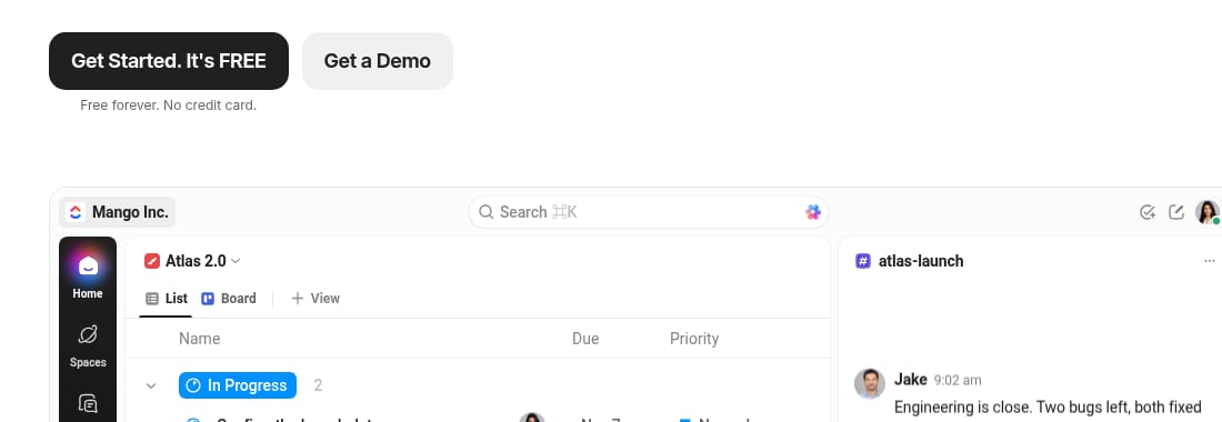
Under the hero copy sit a black 'Get Started. It's FREE' button, with 'Free forever. No credit card.' below it, and a grey 'Get a Demo' button. The top bar repeats 'Get a Demo' beside 'Login' and 'Sign Up'.
Evidence:
Get a Demo
· Seen on clickup.com, homepage hero, the second button · Captured · Direct evidence - Actions in the homepage header
- What to writeThe visible links and buttons in the homepage header, with their exact words and positions.
- Linear · Captured
No finding on this row in the Linear sample.
- ClickUp · Captured
From the same hero finding: the top bar repeats ‘Get a Demo’ beside ‘Login’ and ‘Sign Up’.
- What it is and who it is for
- What to writeThe line that says what the product is and who it is for, word for word, with the page it is on.
- Linear · Captured
PM · High impact
The hero headline names both the category and the audience
The headline reads 'The product development system for teams and agents', and the line under it reads 'Purpose-built for planning and building products. Designed for the AI era.'
Evidence:
The product development system for teams and agents
· Seen on linear.app, homepage hero headline · Captured · Direct evidence - ClickUp · Captured
PM · High impact
The hero describes AI that acts on your work
Under 'One Workspace built to think and work', the hero reads 'ClickUp connects your work, knowledge, and conversations to AI that can find answers, take action, and build alongside you.'
Evidence:
ClickUp connects your work, knowledge, and conversations to
· Seen on clickup.com, homepage hero, the line under the headline · Captured · Direct evidence - Proof
- What to writeThe evidence the page offers for its claims, such as logos, figures, quotes or ratings, with the words, the page and where they sit.
- Linear · Captured
Marketing · High impact
Seven customer logos sit under the product screenshot
Below the hero screenshot, a row shows OpenAI, Vercel, Salesforce, Figma, Cursor, Coinbase and Ramp, with the small label 'POWERING THE COMPANIES BUILDING THE FUTURE' under it.
Evidence:
POWERING THE COMPANIES BUILDING THE FUTURE
· Seen on linear.app, label under the customer logo row below the hero · Captured · Indirect evidence - ClickUp · Captured
From the ClickUp sample’s FAQ, not an analyst’s finding: logos sit under the homepage hero, beside ‘TRUSTED BY THE BEST’.
- Pricing unit and period
- What to writeThe unit used to calculate the price and the billing period selected when you read the page, with the label, where it sits and any plan the page marks.
- Linear · Captured
Designer · Medium impact
Basic and Business state one per-user unit and a yearly billing switch
Basic shows '$10 per user/month' and Business '$16 per user/month', each above a switch labelled 'Billed yearly'. Free reads '$0' and 'Free for everyone', and Enterprise reads 'Custom' and 'Annual billing only'.
Evidence:
per user/month
· Seen on linear.app/pricing, pricing page plan grid, under the Basic and Business names · Captured · Direct evidence - ClickUp · Captured
Marketing · High impact
Business is marked Most Popular at $17 per user a month, billed yearly
With the switch on Yearly, under 'Save up to 33% with yearly', 'Free Forever' shows $0, 'Core' shows $9 beside a struck-through $12, and 'Business', marked 'Most Popular', shows $17 beside a struck-through $25, both per 'user / mo · billed yearly'. 'Enterprise' shows 'Custom'.
Evidence:
Free Forever
· Seen on clickup.com/pricing, first plan card on the pricing page · Captured · Page context - Consistency within and across pages
- What to writeWhere a page repeats or changes its own promise, button or label, from top to bottom or from one page to the next.
- Linear · Captured
No finding on this row in the Linear sample.
- ClickUp · Captured
Designer · Medium impact
The Tasks page opens and closes on the same headline
The ClickUp Tasks page opens with 'Never lose track of work again' and a 'Get started. It's FREE' button, and its closing banner repeats both.
Evidence:
Never lose track of work again
· Seen on clickup.com/features/tasks, Tasks page hero and closing banner · Captured · Direct evidence - What to test with people
- What to writeWhat a capture cannot answer and a test with people can, written as the same task for every product.
- Linear · Captured
Give each visitor the same team scenario. Ask them to choose a paid plan, name it, explain its pricing unit and billing period, and find how to create an account without signing up. Record the plan, route and explanation.
- ClickUp · Captured
Give each visitor the same team scenario. Ask them to choose a paid plan, name it, explain its pricing unit and billing period, and find how to create an account without signing up. Record the plan, route and explanation.
- Open questions
- What to writeWhat the pages did not answer, written as questions for the next reading.
- Linear · Captured
The published sample does not show what follows ‘Get started’. Check the next screen and note whether it asks for an account.
- ClickUp · Captured
The published sample does not show what follows the free start button. Check the next screen and note whether it asks for an account.
- Your reading
- What to writeWhat the differences in the rows above could mean for your product, and one question to test. Mark it as yours.
Our reading, as an example: the two heroes offer different first actions. In the 28 October captures, Linear’s ‘Basic’ and ‘Business’ plans and ClickUp’s ‘Core’ and ‘Business’ plans showed per-user prices with yearly billing. A test could check whether a new visitor finds a sign-up route and can explain the charge.
Fill in the template with coExploro
coExploro drafts findings you can use for the observation rows. Paste a product’s homepage address. coExploro captures that page with its date, then the pricing and features pages when it finds them. An AI model lists what the screenshots show, and four AI analysts, PM (product manager), Marketing, UX (user experience) and Designer, draft findings from that list. A teardown usually takes 2–4 minutes. A teardown you run may also show a UX score. An AI model rates up to six dimensions it can assess from the screenshots, such as visual hierarchy, navigation clarity and trust signals. The UX score is separate from the Overall score, which is a synthesis of the AI analysts’ readings. These public samples do not show a UX score. Pick the findings that answer each row, open the screenshot a finding was read from when one is attached, copy the exact words from there, and leave a row open when no finding answers it. Compare, included with Pro, sets 2 to 5 teardowns side by side, one column per product. You can try one run a day per network without an account, and create a free account afterwards to claim the full canvas, every finding and the sources. A free account includes 3 teardowns a month. Paid plans start at $16 a month, billed yearly. The question, the tests with people, the open questions and your reading stay yours.
The template by hand and in coExploro
By hand
- Product, pages and date
- You open and save each page, and write the date
- Observation rows
- You read every page with each question
- Quotes and places
- You copy the words and note where they sit
- Side by side
- You line up the columns yourself
- Question, tests, open questions and your reading
- You write them
- Time
- As much as the reading takes
coExploro
- Product, pages and date
- Captures the homepage, then the pricing and features pages it finds, with the date
- Observation rows
- Four AI analysts draft findings; you pick the ones that answer each row
- Quotes and places
- A finding can open the screenshot it was read from, when one is attached
- Side by side
- Compare sets 2 to 5 teardowns side by side, with Pro
- Question, tests, open questions and your reading
- Left to you
- Time
- Usually 2–4 minutes to draft a teardown, then your review and template work
| By hand | coExploro | |
|---|---|---|
| Product, pages and date | You open and save each page, and write the date | Captures the homepage, then the pricing and features pages it finds, with the date |
| Observation rows | You read every page with each question | Four AI analysts draft findings; you pick the ones that answer each row |
| Quotes and places | You copy the words and note where they sit | A finding can open the screenshot it was read from, when one is attached |
| Side by side | You line up the columns yourself | Compare sets 2 to 5 teardowns side by side, with Pro |
| Question, tests, open questions and your reading | You write them | Left to you |
| Time | As much as the reading takes | Usually 2–4 minutes to draft a teardown, then your review and template work |
coExploro captures public pages; the rows it leaves to you stay with you.
Read one row across: Linear and ClickUp
Read the filled template one row at a time, starting with the actions in each homepage hero. Linear’s hero linked to an announcement of its Loops feature, and its ‘Get started’ and ‘Contact sales’ buttons came in the closing section, while ClickUp’s hero offered a free start beside a demo request. On what each product is and who it is for, both brought AI into their first lines. Linear’s headline named ‘teams and agents’, and the line under it said ‘Designed for the AI era.’ ClickUp described AI that can ‘find answers, take action, and build alongside you’. On pricing, both priced per user and showed yearly billing in the capture, and ClickUp marked one plan ‘Most Popular’. Only the ClickUp sample has a finding on consistency, and only the Linear sample has one on proof. A row without a finding is a question for the next reading, not a verdict on the product.

Linear · PM · Captured
The hero headline names both the category and the audience
The headline reads 'The product development system for teams and agents', and the line under it reads 'Purpose-built for planning and building products. Designed for the AI era.'
Evidence:
The product development system for teams and agents
· Seen on linear.app, homepage hero headline · Captured · Direct evidence
ClickUp · PM · Captured
The hero describes AI that acts on your work
Under 'One Workspace built to think and work', the hero reads 'ClickUp connects your work, knowledge, and conversations to AI that can find answers, take action, and build alongside you.'
Evidence:
ClickUp connects your work, knowledge, and conversations to
· Seen on clickup.com, homepage hero, the line under the headline · Captured · Direct evidence
Observed by us
Linear’s homepage still opened with ‘The product development system for teams and agents’ and a ‘New Loops’ link, with ‘Log in’ and ‘Sign up’ in its header, and its ‘Get started’ and ‘Contact sales’ buttons sat under ‘Built for the future. Available today.’ near the end of the page.
verified · Source: linear.app (opens in a new tab)
Observed by us
ClickUp’s homepage, read 1440 pixels wide, opened with ‘Get started. It's FREE!’ and ‘Free forever. No credit card.’ under its headline, and ‘Get a Demo’ sat in the header beside ‘Login’ and ‘Sign Up’.
verified · Source: clickup.com (opens in a new tab)
Observed by us
Linear’s pricing page still priced Basic and Business ‘per user/month’, each marked ‘Billed yearly’.
What each row asks
Each row keeps one part of the experience that a visitor meets before signing up, so that the same question is asked of every product. The hero row notes the actions offered in the homepage’s main opening section below the navigation, and what competes for attention there. The header row notes the visible links and buttons in the homepage header, with their exact words and positions. The next row notes how the page describes the product and its intended audience, using the page’s exact words. The proof row notes the logos, figures, quotes or ratings the page uses to support its claims. The pricing row notes the billing unit, the billing period and any highlighted plan. Consistency asks whether the promise, the buttons and the labels stay the same from one part of a page to the next, and from page to page. Fill every row for every product with its own date. In the last row, write what the differences could mean for your product and one question to test, and mark that reading as yours. When a row has no answer, write the question down rather than reading an absence into it.
What only people can answer
A reading of pages says what a product shows; it cannot say what a visitor does with it. Whether a new visitor finds the sign-up, understands what the product is or trusts the proof is a question for a test with people, and the template keeps a row for it so the question is not lost. Write each one as the same task to observe for every product, such as creating an account or finding a price, and run it on your own product first. Use this matrix to compare how visitors find and understand the next step; SaaS competitor analysis compares offers and plans, and the product teardown template covers one product by role.
Limits
What this UX template does not cover
- It reads public pages on a desktop screen: it does not test a product with people, time a task or reach screens behind a login.
- A filled field describes a page on its capture date; another day, country or screen width can show a different page.
- The observation examples come from published sample findings or, where labelled, a sample FAQ; the test tasks, open questions and readings are suggestions written for this guide.
- Check an observation against its screenshot before it goes into a design review, and if you also read the live page, keep that reading under its own date.
See it on a real product
The hero headline names both the category and the audience · Linear
Evidence:
The product development system for teams and agents
· Seen on linear.app, homepage hero headline · Captured · Direct evidenceThe hero describes AI that acts on your work · ClickUp
Evidence:
ClickUp connects your work, knowledge, and conversations to
· Seen on clickup.com, homepage hero, the line under the headline · Captured · Direct evidence
Linear
Issue tracking and product operations
Captured
Linear's homepage, features and pricing pages: a hero for teams and agents, one hero link to Loops, and Basic and Business priced per user a month.
ClickUp
Work management platform
Captured
ClickUp's homepage, Tasks and pricing pages: a hero about AI that acts on your work, Business marked Most Popular at $17 billed yearly, and six logos.
Questions
What is a UX competitive analysis?
It compares how competing products support the same user task, using the same questions. Read the pages on the same day where possible, and keep the date beside every observation. This template keeps to the public pages before sign-up: the actions in the homepage hero and in the header, what the product is and who it is for, proof, pricing and consistency. Each answer keeps its evidence: the words, the page address, where they sit and the date.
What should a UX competitive analysis template include?
One column per product, your own first, and one row per question, each with the observation, the words it quotes, the page address, where they sit and the day you read the page. Add rows for what to test with people and for open questions, so what the pages did not answer stays apart from what they did.
How is a UX competitive analysis different from a UX audit?
A UX audit reads one product, usually your own, against a set of principles. A UX competitive analysis reads several products with the same questions, to see how yours compares with the ones a user would weigh against it.
Is a UX competitive analysis the same as usability testing?
No. It reads what the pages show; usability testing observes people using a product. The two answer different questions, and a competitive analysis is often where the tasks for a test come from.
Can coExploro do a UX competitive analysis?
It drafts findings you can use in one. Paste each product’s address, and four AI analysts draft findings from a dated capture of its public pages; Compare, included with Pro, sets 2 to 5 teardowns side by side. Choosing the findings for each row, the tests with people, the open questions and your reading stay yours.
Run your own
Start with one product.
See how a competitor’s pages lead a new visitor. Paste a competitor’s homepage address. coExploro captures its public pages, and an AI model lists what the screenshots show. Four AI analysts use that list to draft findings about the actions offered, the product and its audience, pricing and proof. A teardown usually takes 2–4 minutes.