Guide
How to do a UX audit: a checklist and real examples
By coExploro · Published · Updated
Reviewed and edited by coExploro · Independent, not affiliated · Public methodology · Corrections: support@coexploro.com
A UX audit is a review of a product’s pages against a checklist of criteria, such as visual hierarchy, navigation and calls to action. It ends in a list of problems, each with its evidence, ranked by what to fix first. coExploro runs one on a site’s public pages from one address, in 2–4 minutes.
- Set the scope — name the pages, the visitor and the one question the audit answers.
- Capture the pages — save each page with its date and screen width.
- Check the six dimensions — go through the checklist below on every page.
- Write the findings — one observation each, with the part of the page it came from.
- Rank and hand off — order the findings by impact and say what to change or test next.
Yearly (save 20%)
When you need a UX audit
Run a UX audit, also called a user experience audit, when you need to know where a product’s pages make a visitor work harder than they should: before a redesign, before a launch, when a page that matters underperforms and your analytics do not say why, or after many small changes have piled up on one page. It works on a rival’s site too: the same checklist shows how a competitor leads a visitor to a first step, which you can set beside your own pages. Keep the audit to a few pages and one question, such as whether a new visitor can find the price and start a trial, so every finding answers something you will act on. For one landing page, how to do a landing page teardown reads the page in four roles.
Run a UX audit with coExploro
A coExploro product teardown does steps 2 to 4 on a site’s public pages. Give it an address, yours or a rival’s: in 2–4 minutes it captures that page with its date, then the site’s pricing and features pages when it finds them. It gives them one UX score across the six dimensions of the checklist below, each dimension with one sentence that names the page element behind its score, and an AI UX analyst writes findings with an impact level, beside PM, Marketing and Designer analysts reading the same captured pages. The website UX audit page shows what a run returns. You can try one run a day per network without an account, a free account includes 3 teardowns a month, and paid plans start at $16 a month billed yearly. It does not sign in, test the site with people or read your analytics.
A UX audit by hand and in coExploro
By hand
- Pages
- The pages and question you choose
- Capture
- Screenshots you save and date
- Checklist
- You score each criterion
- Findings
- You write each one
- Time
- The time your own reading takes
coExploro
- Pages
- The page you paste, then the pricing and features pages it finds
- Capture
- A dated capture of each page
- Checklist
- Six dimensions scored 0 to 100, each with a one-sentence reason
- Findings
- Findings from an AI UX analyst, each with an impact level
- Time
- 2–4 minutes
| By hand | coExploro | |
|---|---|---|
| Pages | The pages and question you choose | The page you paste, then the pricing and features pages it finds |
| Capture | Screenshots you save and date | A dated capture of each page |
| Checklist | You score each criterion | Six dimensions scored 0 to 100, each with a one-sentence reason |
| Findings | You write each one | Findings from an AI UX analyst, each with an impact level |
| Time | The time your own reading takes | 2–4 minutes |
coExploro reads public pages; it runs no usability test and reads no analytics.
A UX audit checklist in six dimensions
Check each page against the same six questions, and write down the page element behind each answer, so another reader can check it. A dimension the page does not show, such as loading states in a still screenshot, gets no score rather than a guessed one: on 23 of coExploro’s 27 public samples, the capture could not show all six.
The six dimensions of a UX audit checklist
What to check
- Visual hierarchy
- Does the eye meet the most important thing first, and does one message lead?
- Navigation clarity
- Can a visitor tell where they are and find pricing, features and sign-in?
- Content quality
- Does the copy say what the product does, for whom, in plain words?
- CTA effectiveness
- Is the first step clear, or do several buttons compete for it?
- Trust signals
- What proof sits near the ask: customers, figures, security, policies?
- Performance perception
- Do loading states tell the visitor that something is happening?
coExploro
- Visual hierarchy
- Layout clarity, spacing, type hierarchy and visual flow
- Navigation clarity
- Menu structure, wayfinding and link clarity
- Content quality
- Copywriting, clarity of the value proposition and readability
- CTA effectiveness
- Button design, placement, contrast and specificity
- Trust signals
- Social proof, security badges, testimonials and brand credibility
- Performance perception
- Loading states and perceived speed, when the capture shows them
| What to check | coExploro | |
|---|---|---|
| Visual hierarchy | Does the eye meet the most important thing first, and does one message lead? | Layout clarity, spacing, type hierarchy and visual flow |
| Navigation clarity | Can a visitor tell where they are and find pricing, features and sign-in? | Menu structure, wayfinding and link clarity |
| Content quality | Does the copy say what the product does, for whom, in plain words? | Copywriting, clarity of the value proposition and readability |
| CTA effectiveness | Is the first step clear, or do several buttons compete for it? | Button design, placement, contrast and specificity |
| Trust signals | What proof sits near the ask: customers, figures, security, policies? | Social proof, security badges, testimonials and brand credibility |
| Performance perception | Do loading states tell the visitor that something is happening? | Loading states and perceived speed, when the capture shows them |
coExploro scores each dimension from 0 to 100, with one sentence that names the page element behind the score.
Where the UX findings sit on 27 SaaS samples
coExploro’s 27 public samples are 27 well-known products, not a sample of the market, captured between 8 August 2026 and 29 October 2026. Each sample shows one finding per analyst, chosen for publication from that analyst’s findings, so each holds one UX finding, and we sorted those 27 findings by the part of the page they are about. Pricing tables and plan grids came first, with 8 of 27: how much a table or a row of plan cards asks a reader to compare, such as four plans side by side or cells marked only with a check or a minus sign. The header and navigation came next with 5, then the hero’s first action with 5 and the pricing FAQ with 4; on the hero, a free start sat beside a demo request or a sign-up beside a download. A run reads a site’s homepage, pricing and features pages, so pricing pages weigh heavily here. A count says where these published findings sit, not which site is better or what every UX audit finds.
| Part of the page | Samples |
|---|---|
| Pricing tables and plan grids | 8 |
| Header and navigation | 5 |
| The hero’s first action | 5 |
| Pricing FAQ | 4 |
| Forms | 2 |
| Other | 3 |
| All samples | 27 |
Which samples are in each group
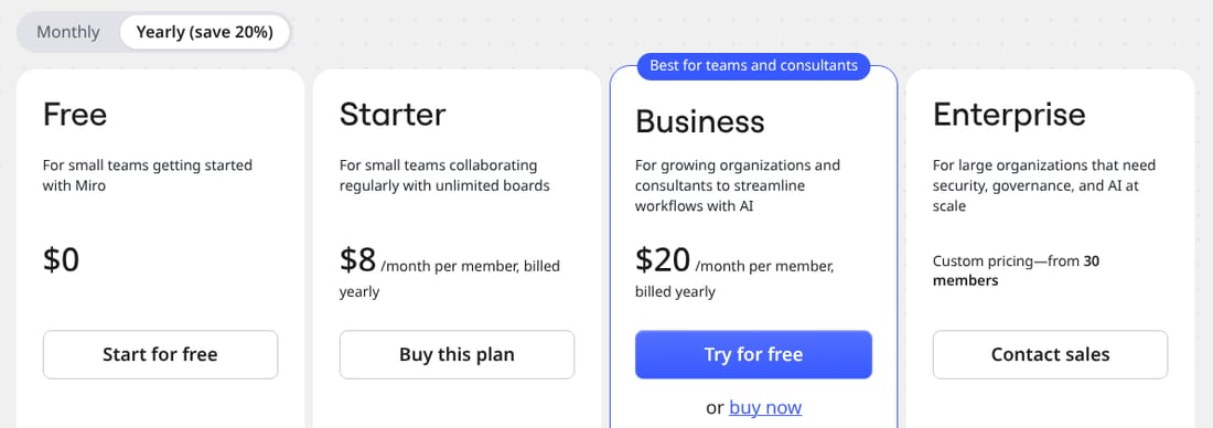
- Pricing tables and plan grids: Supabase, Slack, Figma, n8n, Shopify, Clerk, Asana, Miro
- Header and navigation: Stripe, Calendly, Intercom, Klue, Kompyte
- The hero’s first action: Linear, GitHub, Atlassian, ClickUp, Loom
- Pricing FAQ: Notion, Webflow, Canva, Zapier
- Forms: monday.com, Crayon
- Other: Zoom, OpenAI, Contify
UX audit examples from real SaaS pages
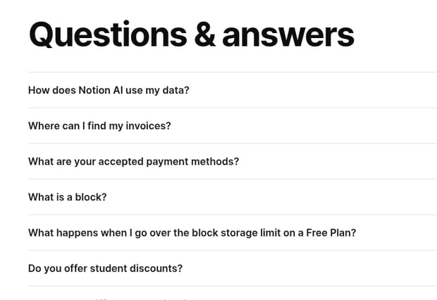
Three findings from the samples show what one line of a UX audit looks like. In the Notion sample, captured on 29 October 2026, the pricing page opened its questions with how Notion AI uses your data, ahead of invoices and payment methods. On Supabase’s pricing page, captured the same day, many cells of the plan comparison held a green check mark or a grey minus sign rather than words. On Crayon’s, the pricing page was a ten-field form with no plan or price. Later that day, after the captures, the Notion and Crayon pages still opened the same way, as the observations below show. Each card below names the analyst, the capture date and, where the finding has one, the quote it rests on, marked on the capture.
Notion · UX · Captured
Seventeen questions sit under the pricing table
The pricing FAQ, 'Questions & answers', sits below the 'Plans and features' table and lists seventeen questions. It opens with 'How does Notion AI use my data?' and only then asks 'Where can I find my invoices?' and 'What are your accepted payment methods?'
Evidence:
How does Notion AI use my data?
· Seen on www.notion.so/pricing, FAQ below the plan tables, first question · Captured · Indirect evidence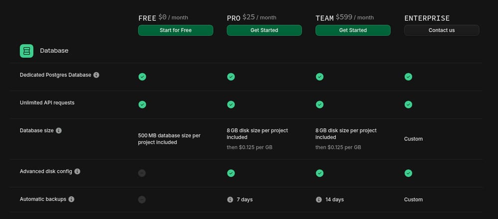
Supabase · UX · Captured
Comparison cells use green check marks and grey minus signs
In the plan comparison table further down the pricing page, many cells hold a green circle with a check mark or a grey circle with a minus sign rather than words. Other cells carry values such as '7 days', 'Never' or 'Custom'.
Evidence:
Advanced disk config
· Seen on supabase.com/pricing, pricing page comparison table, Database group, row label beside a grey minus sign for Free and green check marks for the paid plans · Captured · Indirect evidence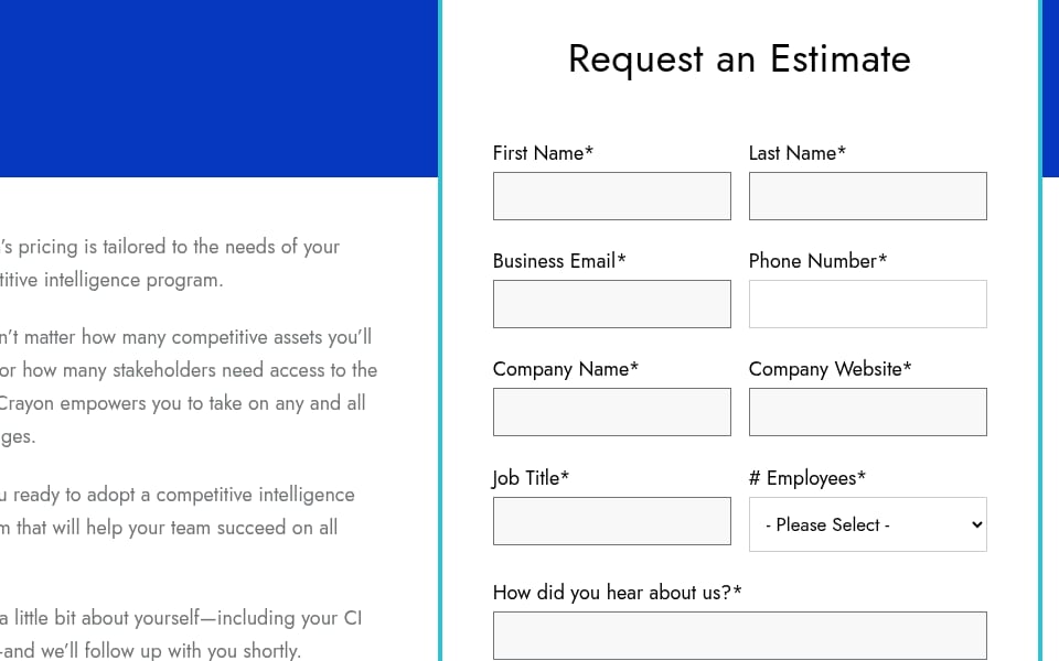
Crayon · UX · Captured
The pricing page is a ten-field estimate form
The pricing page shows a 'Request an Estimate' form and no plan or price. All ten field labels end in an asterisk, from 'First Name*' to 'Message*', and '# Employees*' is a drop-down reading '- Please Select -'. The button below reads 'Send Inquiry'.
Evidence:
Request an Estimate
· Seen on www.crayon.co/pricing, pricing page, heading of the form · Captured · Indirect evidence
Observed by us
The first question under ‘Questions & answers’ on Notion’s pricing page read ‘How does Notion AI use my data?’.
Observed by us
Crayon’s pricing address led to a page headed ‘Request an Estimate’, with a ‘Send Inquiry’ button under its form.
What a UX audit report holds
A UX audit report states its scope first: the pages read, the date and screen width of each capture, and the question the audit answers. Then come the scores per dimension and the findings, each with the part of the page it came from, its impact and what to change or test. It ends with what the audit did not cover, such as signed-in screens, mobile layouts or live behaviour. In coExploro, a teardown holds the UX score with its six dimensions, the four analysts’ findings with their recommendations, and the capture they were read from, with the screenshot behind a finding when one is attached. coExploro’s methodology states what a capture can and cannot show.
UX audit vs heuristic evaluation
A heuristic evaluation is one method inside a UX audit: evaluators check an interface against a short list of usability principles, such as Jakob Nielsen’s ten usability heuristics, and note each place it breaks one. A UX audit is the wider review. It can include a heuristic evaluation, and it can add analytics, accessibility checks, a review of the content and notes from user research. It ends in a list of problems in the order to fix them. Use a heuristic evaluation to check one interface against known principles, and a UX audit when you need to decide what to fix first across several pages. The six dimensions above sit between the two: a fixed checklist, scored for the pages a run reads, with the evidence for each score.
Agency UX audit or a self-serve AI audit
An agency or a consultant can do what a capture of public pages cannot: test the product with real users, read your analytics, review signed-in flows and accessibility in depth, and walk your team through a report. That work is scoped and priced per project. A self-serve AI audit reads public pages from one address and returns findings in minutes, so it suits a first pass, a rival’s site or a check after a change. coExploro is not an agency and does no human audit: AI analysts draft its findings from a dated capture. The two answer different questions: a quick reading shows where to look, and people show why visitors struggle there.
An agency UX audit and coExploro
Agency or consultant
- Who reads
- UX specialists
- What it reads
- The pages, flows and data you give it access to
- Testing with people
- Can be part of the scope
- Signed-in screens
- Can be reviewed with access
- Time
- Set per project
- Price
- Quoted per project
coExploro
- Who reads
- Four AI analysts: PM, Marketing, UX and Designer
- What it reads
- Public pages: the one you paste, then the pricing and features pages it finds
- Testing with people
- Not done
- Signed-in screens
- Not captured
- Time
- 2–4 minutes
- Price
- A free account with 3 teardowns a month; plans from $16 a month billed yearly
| Agency or consultant | coExploro | |
|---|---|---|
| Who reads | UX specialists | Four AI analysts: PM, Marketing, UX and Designer |
| What it reads | The pages, flows and data you give it access to | Public pages: the one you paste, then the pricing and features pages it finds |
| Testing with people | Can be part of the scope | Not done |
| Signed-in screens | Can be reviewed with access | Not captured |
| Time | Set per project | 2–4 minutes |
| Price | Quoted per project | A free account with 3 teardowns a month; plans from $16 a month billed yearly |
Agency prices are set per project, so this page states none.
Limits
What a UX audit of public pages does not show
- A capture shows each page on one day at one screen width, so a mobile layout, a variant under test or a later change may read differently.
- A reading of public pages has no visitor data, so it shows where a page may ask too much of a visitor, not how many visitors leave there.
- Signed-in screens, onboarding after sign-up, and behaviour such as hover, animation and load speed are mostly outside a capture.
- AI analysts draft the findings from a capture, so check a finding against the live page before you change anything because of it.
See it on a real product
Seventeen questions sit under the pricing table · Notion
Evidence:
How does Notion AI use my data?
· Seen on www.notion.so/pricing, FAQ below the plan tables, first question · Captured · Indirect evidencePro starts at $25 a month and Team at $599 · Supabase
Evidence:
Add features such as SSO, control over backups, and industry certifications.
· Seen on supabase.com/pricing, pricing page, TEAM plan card, line under the plan name · Captured · Indirect evidence
Notion
Connected workspace and docs
Overall score 71 · Captured
Notion's pricing page shows Plus at $10 and Business at $20 per seat a month with 'Pay yearly' selected, and seventeen questions under its plan table.
Supabase
Backend-as-a-service on Postgres
Overall score 74 · Captured
Supabase prices Pro from $25 and Team from $599 a month, shows twelve customer logos on its homepage, and compares its plans across 62 rows.
Crayon
Competitor intel and sales battlecards
Overall score 68 · Captured
Crayon's pricing page is a ten-field estimate form with no price shown, and its homepage opens customer cards with figures and lists two AI features.
Questions
What is a UX audit?
A UX audit, or user experience audit, is a review of a product’s pages against a checklist of criteria, such as visual hierarchy, navigation, content, calls to action and trust signals. It ends in a list of problems, each with its evidence, ranked by what to fix first.
What is the difference between a UX audit and a heuristic evaluation?
A heuristic evaluation checks an interface against a short list of usability principles, such as Jakob Nielsen’s ten usability heuristics. A UX audit is the wider review: it can include a heuristic evaluation and add analytics, accessibility checks and user research, and it ranks what to fix first.
What should a UX audit checklist cover?
Six things on each page: visual hierarchy, navigation clarity, content quality, calls to action, trust signals and how loading states feel. Write down the page element behind each answer, so another reader can check it.
What does a UX audit report include?
Its scope, with the pages read and the date of each capture, a score per criterion, the findings with the part of the page each came from, their impact and what to change or test, and what the audit did not cover.
Can AI do a UX audit?
AI can do the part that reads the pages. From a dated capture of a site’s public pages, coExploro gives them a UX score in six dimensions and its AI UX analyst writes findings, in minutes. It cannot test the product with people or read your analytics, so it does not replace a usability test.
Run your own
Start with one product.
See how a competitor's homepage and pricing page are built to convert. Paste its address: coExploro captures its public pages, such as the homepage and pricing page, and four AI analysts read them for calls to action, pricing and trust signals. It takes 2–4 minutes.